Best of 2015

In reflecting on 2015 I realized I had some amazing architectural experiences.  I thought I'd share them!

1. Maggie's West London Centre, by Rogers Stirk Harbor Partnership (RSHP)

It's a few years old but this is the best new building I've experienced in some time.  It's a cancer care facility---a medical institution---but meant to feel like a home.  I loved it: highly imaginative and beautifully designed at every level.  Who puts a diagonal roof structure on a square grid of columns?  Here it makes perfect sense.  I was also struck at how the design revealed the straight line of influence from mid-century California to the London School.  (It is not open to the public.)

2. Fondation Jérôme Seydoux-Pathé, by Renzo Piano Building Workshop

Here, as at the Maggie's Centre, we were fortunate enough to have a private tour and be alone in the building.  A once-in-a-lifetime experience!  The rooftop reading room is the centerpiece of Piano's design, and it's one of the great rooms in Paris---a city with a lot of them!

3. Chartres Cathedral, mid-renovation

A major restoration is underway at Chartres Cathedral.  I couldn't miss the opportunity to see it in-progress.  (The left image shows the choir completed versus the South transept in its old state.)  I don't agree with Martin Filler that this is "scandalous" but it's certainly a departure from the dark and gloomy interior to which we are accustomed.

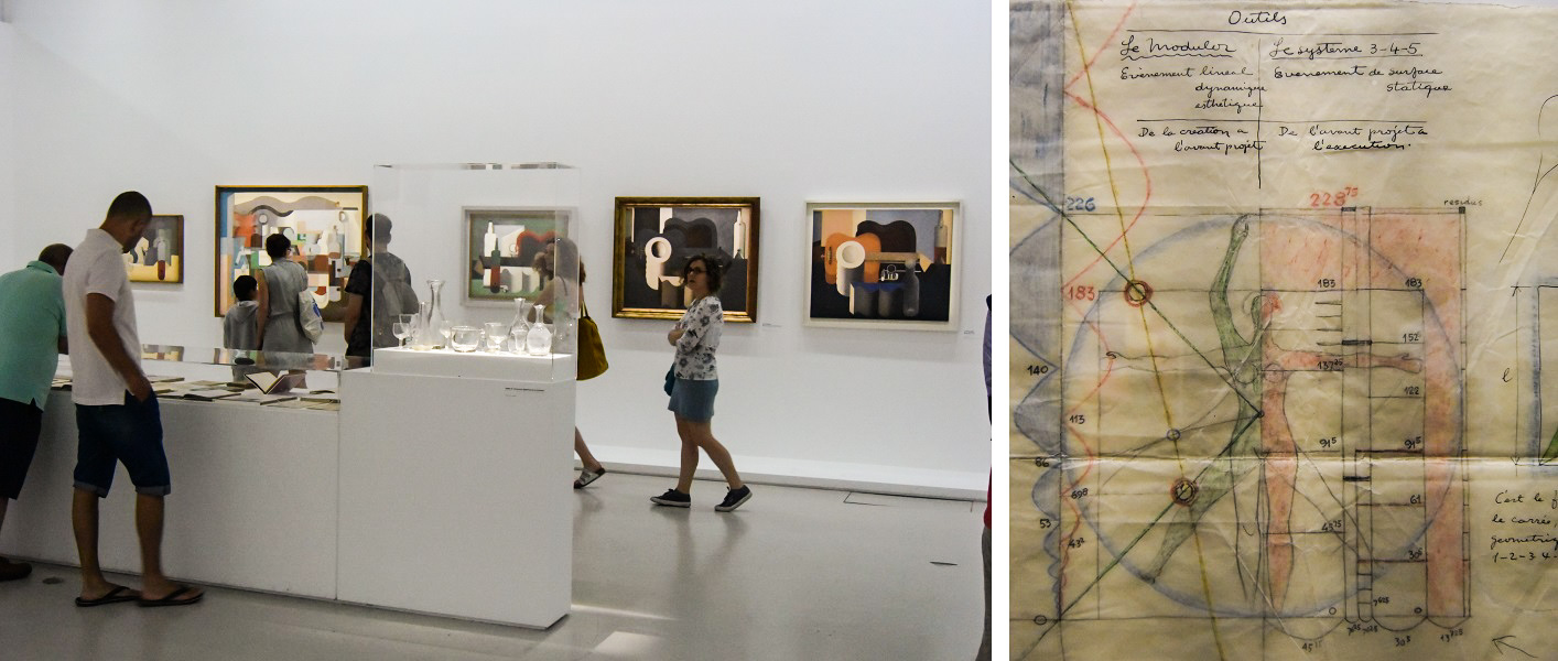
4. Le Corbusier: Mesures L'Homme exhibit at Centre Pompidou

Everybody loves Le Corbusier, and there's always more to learn about him!  I thought this exhibit was very well curated and the presentation was brilliant.

Also visited for the first time:
Lawn Road Flats (Isokon building), by Wells Coates
Kew Gardens (link)
St. Bride's Church, by Wren
Saw Swee Hock Student Centre, by O'Donnell + Tuomey Architects
Walkie Talkie Sky Garden, by Rafael Viñoly
Fondation Louis-Vuitton, by Gehry Partners
Musée du quai Branly, by Jean Nouvel
"la Caixa" Foundation, Barcelona, addition by Arata Isozaki (and Aalto exhibit - link)
Milwaukee Art Museum, old by Saarinen, new by Calatrava
Charnley-Persky house (SAH) and Madlener house (Graham Foundation)

The 1970s: the Attitudinal Barrier

After the energy crisis of 1973, a number of architects quickly became interested in solar architecture and other energy-efficiency measures.  However, these practices did not appeal to many of the establishment and "star" architects of the time.  By the late 1970s the resistance became a point of frustration for those in the solar architecture movement, as seen in this passage from Greg Franta:

The attitudinal barrier of architects themselves may also be a major constraint. Philip Johnson, FAIA, is a world-renown architect (of nonsolar oriented buildings) and winner of the 1978 AIA Gold Medal Award. Mr. Johnson was recently asked when he would start including solar applications in his design process. His response was, "...only after all of the other architects do." Another leading architect, John Dinkeloo, was quoted during the judging of the 1977 Progressive Architecture Awards Program as saying, "I'll be glad when 10 years have passed, and everybody has gotten off this solar kick. They'll find out what a bunch of bologna it is, and get back to work." The attitudinal barriers of leading architects may be a much more serious problem than many people care to admit.

---Gregory Franta, "Commercializing Solar Architecture," Solar Energy Research Institute (March 1979).

See also: A note on the solar architecture of the 1970s

Richard Levine: A 1970s Solar Architect

When you look at solar houses from the 1970s---there were dozens of books which described hundreds of houses---you find a lot of solar architects, often unfamiliar.  You wonder what became of them.

One such architect is Richard Levine.  I quoted Levine in The Solar House, in an overview of the aesthetic issues in 1970s solar architecture.  (The book focuses on solar houses prior to 1973 and only surveys the 1970s briefly.)  I included this quotation because I thought it represented a strong idea:

The first steam powered vessels to cross the Atlantic looked like awkward sailing ships not steamships (just as the first automobiles looked like awkward carriages, not Model T’s).  They carried a full complement of sails because their reliability was well below 100%.  It was not long before they achieved the reliability necessary to evolve their own form and their own structure, vastly different from the form of its progenitors.

Solar building is beginning to embark on this same sort of evolution—awkward, not able to do the job alone, working with adaptations of unsuitable existing forms.  The turning point will be when we change our commitment from an add­-on, booster mentality to a 100% solar sensibility.  At that point evolution will be swift and irreversible.  Solar devices, solar buildings and solar villages will rapidly develop appropriate forms and structures.

Then, I wrote: "Such an evolution did not mature in the 1970s."

So what became of Richard Levine?  He is a professor at the University of Kentucky.  Today he was profiled in the Lexington Herald-Leader, featuring his Raven Run house as well as some thoughts about the future of energy-saving homes.  It's a excellent piece, because it clearly connects that experimental period, which can seem so remote, with the problems and opportunities of today and tomorrow.  I borrowed the photos above from the article.

Link to Lexington Herald-Leader article: "Early solar architect sees big changes ahead for American homes"

See also: A note on the solar architecture of the 1970s

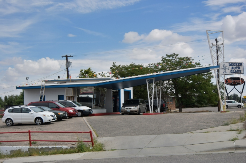
The Batwing 66 in Wyoming

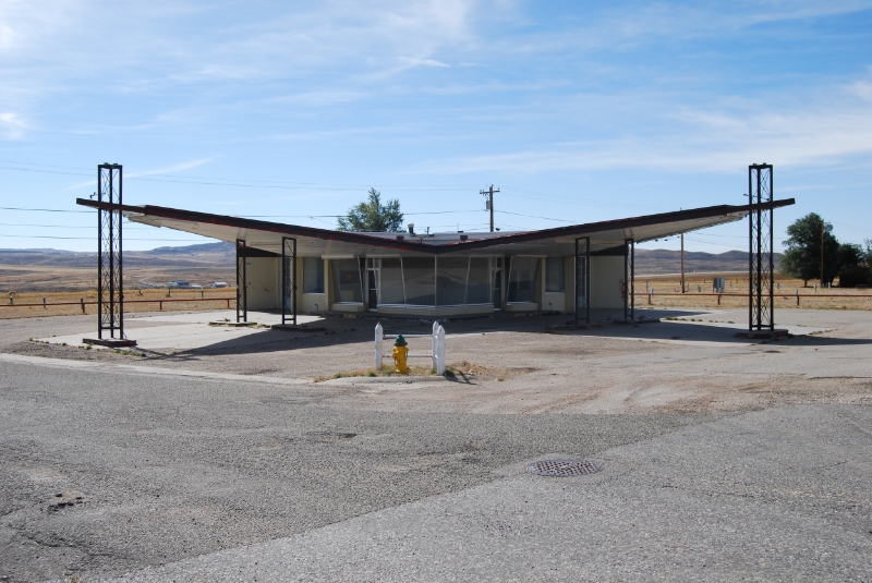
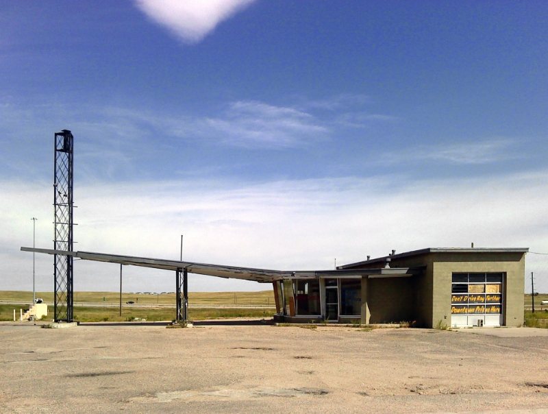
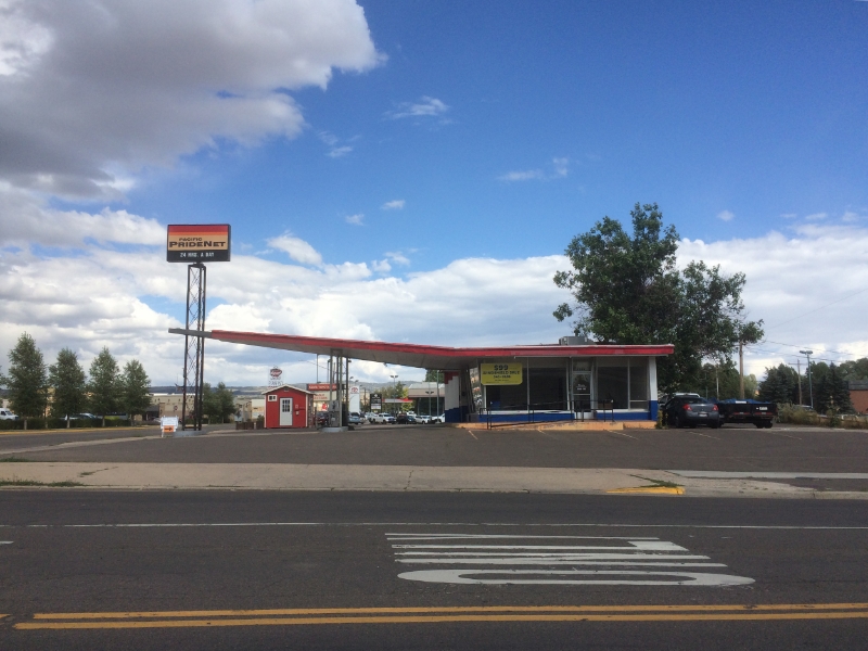
The "Batwing 66" is an iconic type of roadside architecture from the 1960s, gas stations built across the country by Phillips 66.  Most were designed with one "wing" but some have two.  I love these structures, and I enjoy looking for them when traveling across the countryside.

The stations were designed by Clarence Reinhardt, who is otherwise unknown.  The type is also known as the Harlequin 66, because of the butterfly resemblance.

Are there are others in Wyoming?  Probably.  Please comment with other examples!

Update: Here's another in Lovell, Wyoming found on Flickr. [1]  [2]
 

#SD2015

Update (Oct. 17, 2015): The SURE House by Stevens Institute of Technology is the overall winner.

The 2015 Solar Decathlon is underway in the curious location of Irvine, California.  (See earlier post: The Solar Decathlon: Back to Irvine.)  Faithful readers know I discussed the Decathlon at length in The Solar House and I've offered some criticism of the contest*.

This year I'm following from afar.  I'm looking at the official Decathlon material on their website and Twitter and Flickr.  I'm looking at news stories.  I'm looking at Youtube videos.  And I'm looking at the websites of the teams, and what the teams share on various social media platforms.

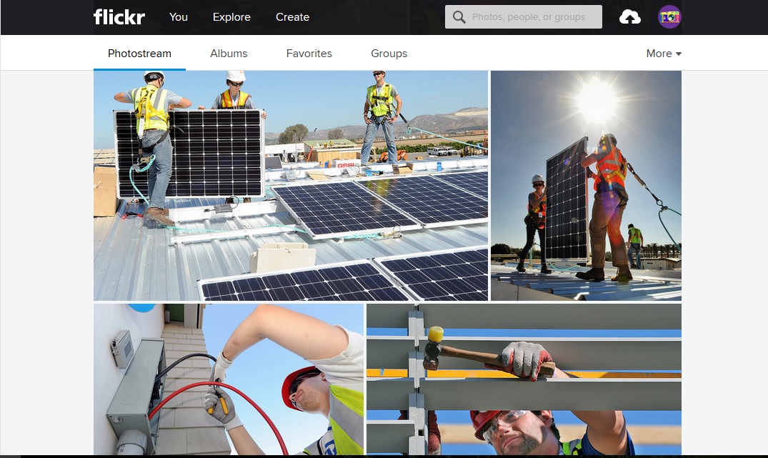
What strikes me in my virtual tour is how the "blue-collar" aspects of the activity are celebrated above all else.  Here's a sample screen-grab from the DOE's Flickr page:

First thought---and I absolutely do not mean to denigrate the efforts of the students---does this look like a University-level professional education, or a trade-school activity?  I'm the first to advocate for the value for architecture students to understand construction, and to do so in a hands-on manner.  Nevertheless, to foreground the enterprise in this manner distorts its character, I think, if we can all agree that the primary activity of architecture is design.  It is difficult, at least at this stage, to find the traditional products of architecture such as drawings and models, nor the traditional products of engineering like technical analyses and calculations.  Not to mention new methods like simulations.  You can locate some plans and diagrams, but you have to dig pretty deep.  In other words, I'm simply observing that the design intelligence of the competition is overshadowed by this kind of coverage.  

*See:
Help Wanted: The Solar Decathlon
Too Expensive: The Solar Decathlon
The “Shading Decathlon”?