An Active Solar Primer

Just in time for next week's American Solar Energy Society (ASES) conference...

My colleague Jon Gardzelewski & I were asked to write an article on active solar energy systems for a magazine for rural homeowners.  Here's a link:

Is Solar Electric or Solar Thermal Best for You? (pdf)

An essential point is that consumers who may have priced solar electric systems a few years ago should not assume that those prices would hold true today.  Here's a slide which I've used from time to time.

The Solar House: Then and Now, on Youtube

A talk I gave in March---at the National Museum of Wildlife Art in Jackson, WY---was professionally recorded and posted to Youtube.  It gives an overview of some of the themes of the book.  The title was "The Solar House: Then and Now."

This was part of the University of Wyoming's "Saturday University," an excellent program.  Thanks to Paul Flesher and the other organizers and sponsors.

Unearthed: The Lo-Cal House

In The Solar House I briefly outlined a theme in the 1960s-80s, when some building scientists and other experimenters realized that good insulation and airtightness would be a more effective first energy-saving technique than passive solar heating.  I wrote:

"Solar vs. superinsulation" became a serious question for those interested in passive methods of reducing building energy use, and it remains so today (though the concepts are not mutually exclusive).  Light-and-tight vs. mass-and-glass is another was of expressing this philosophical debate.

One of the important early projects to explore the benefits of superinsulation and airtight construction was the Lo-Cal House, designed by the University of Illinois Small Homes Council.  The book includes a few paragraphs about the Lo-Cal House and an illustration.

A short film about the Lo-Cal House has just been unearthed.  Interestingly, its title is "Solar House Design," even though the main subject is envelope construction.  It's from 1976, and it features Wayne Shick and Seichi Konzo of the Small Homes Council:

My friend Jim Laukes found the video in the SHC archives, and he prepared it for the web.  The legendary Bill Rose also made it happen.  (Note: Bill will be a keynote speaker at the North American Passive House Conference this fall.)

Finally, I'll mention that Seichi "Bud" Konzo is a fascinating character.  I hope to write more about him in the future.  In the meantime, I'll mention his book The Quiet Indoor Revolution (1992), which in essence traced the changes in building science since the 1920s (and Konzo often played a key role in those changes).  It's outstanding, and should be much better-known.


Using an Art Museum

Note: I wrote this while in Europe with students, for them, and thought others might be interested.

The Wallace Collection, London

The Wallace Collection, London

Many people find museums difficult, I think, because they feel compelled to shuffle through miles of works one-by-one, stopping to study each of them and dutifully reading every description. Maybe this gets instilled in elementary school somehow. Or maybe it’s what people feel they ought to do. What a terrible experience! Where’s the passion? Where’s the fun?

Instead, consider this advice:

Browse quickly and be pulled. You may move rapidly, perhaps not even breaking stride in a room full of masterpieces. Soon enough, something will grab you. There will be a spark, a connection.  Stop and spend time with that one. Be submissive; stay in that moment of intimate contact as long as you can. You might make a sketch if the spirit moves you, but draw freely without much thought.

Then when the mood is broken and you disengage, stay with that piece that grabbed you and (only then) turn on your analytical brain. Look at the work again. View it from every angle, and multiple distances. Figure out why it pulled you. What is the work’s power? Perhaps it will grab you again!

Then you may start thinking about the usual questions of subject and meaning and technique: what is the artist saying and how is he saying it? (Note: these questions don’t come first! For 99% of the works on display, you don’t care about these questions today.) 

Before reading the museum label, make your own interpretations. Ask what techniques were used to achieve such a powerful effect on you. Take some notes.

You’ve saved the signage for last. Go ahead, but don’t worry about giving the experts’ interpretation too much credence. The description may be interesting, or it may be a worthless detour. It certainly isn’t the point of the experience. For some people a museum visit becomes an endless effort to collect stray facts, as if the brain were meant to store them like an encyclopedia. I bet your own notes will end up being the ones you want.

Now you may take a break. Get a coffee. Don’t feel like you need to keep going forever. A successful museum visit, in my opinion, includes deliberately limiting your intake. If two or three works grab you in an afternoon, that’s plenty. However, while you may disregard the works which do not grab you (for now), do not use this ignorance-by-choice to pass judgment against them. If a piece is in a museum, you can bet it has true merit, and your inability to know that merit at the moment is surely nothing to brag about.

Read more later. You’re still blissfully naive about that piece that grabbed you. It is important, eventually, to know the real answers about subject and meaning. If the real answers differ from your interpretations, you should do the hard work of reconciling the balance sheet. In some cases, after learning more you may end up having a diminished view of that piece which was so powerful when you visited. In most cases, you’ll confirm a new passion.

Finally, come back later. All those other pieces which didn’t grab you the first time are waiting for their chance to try again!

(Update: By contrast, but making the same essential points, the New York Times says “slow down.”)

Alvar Aalto and Solar Geometry

In The Solar House I discuss how modern architects developed a new understanding of the science of solar geometry through drawings.  Studies including solar angles, to determine the spacing of buildings for heliotherapeutic considerations, came out of the Bauhaus in c.1930.  I conclude that the first solar geometry studies made specifically for solar heating (and shading to prevent overheating) were made in late 1937, probably independently, by Keck & Keck and Henry N. Wright.  In addition to those examples, Le Corbusier made such a drawing 1938, as I discuss and show in Le Corbusier and the Sun.

It's possible that Alvar Aalto should be included in that short list.  In a 2012 lecture, British historian Dean Hawkes mentions that he found section drawings of the Villa Mairea with a critical sun angle of 52˚ shown.  This indeed corresponds to noon at the summer solstice in Noormarkku, Finland.  Aalto designed the Villa Mairea in 1938.  (Video here; the pertinent bit starts about 18:42.)  Hawkes is one of my favorite historians, and the full video is well worth the time.

We may never know definitively who drew the first 2D shading diagram, but clearly the convention came of age in 1937-38.


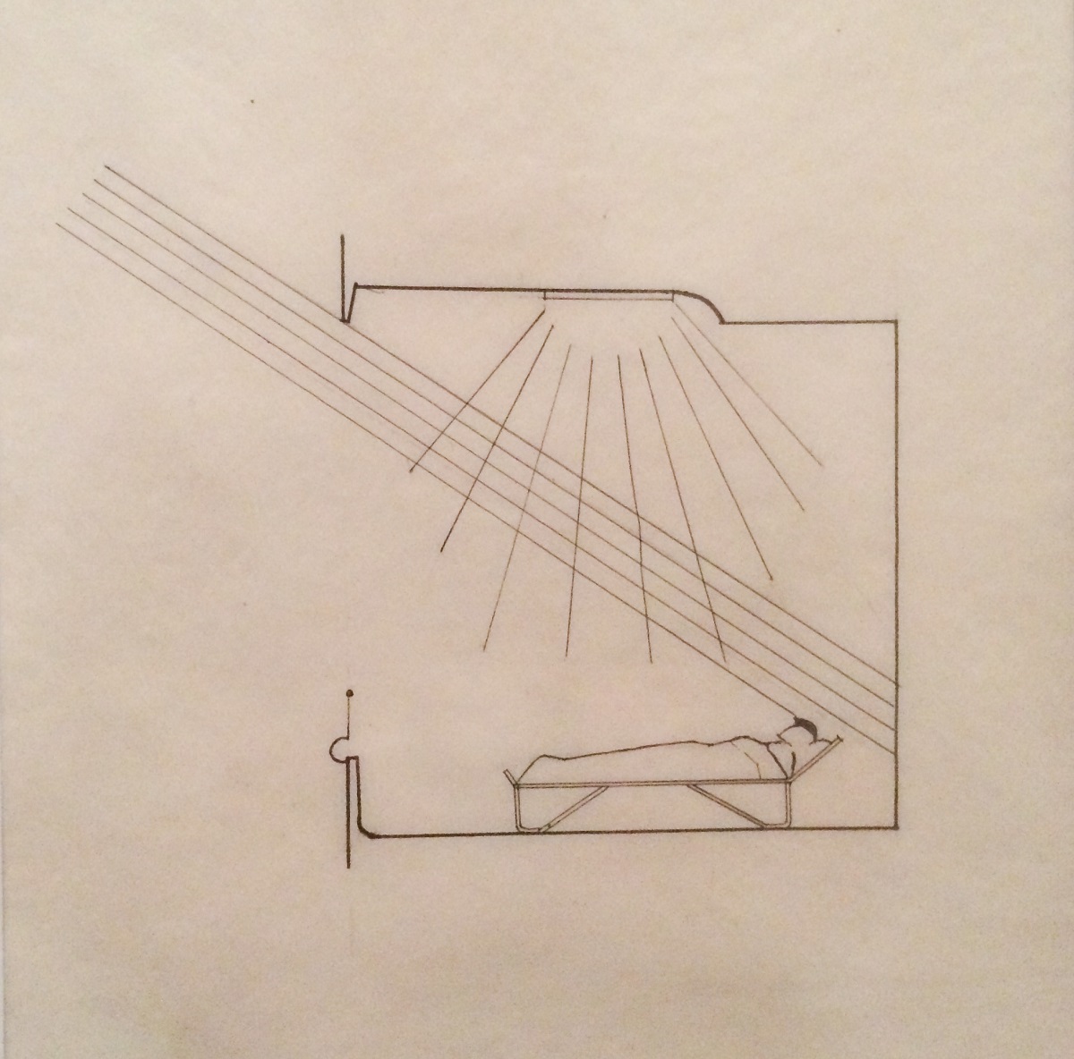
[Added July 2015]  Aalto used solar geometry diagrams in the design of the Paimio Sanatorium.  The drawing below is undated but made in the 1929-33 period.

To be clear, this is not a shading diagram, as the purpose is to show winter sunlight penetrating deep into the patient rooms for therapeutic purposes, and no shading devices are shown.  In this case Aalto used a sun angle of 34˚.

This drawing was included in the terrific exhibit Alvar Aalto 1898-1976. Organic Architecture, Art and Design, which I saw at the Caixa Forum in Barcelona.  It is also published in the exhibition catalog Alvar Aalto: Second Nature.

For more on the Paimio Sanatorium, see Tuberculosis and Solar Architecture (part 2).