A few thoughts on the Architecture of Energy-Efficiency

For an architect, energy-efficiency and aesthetics are sometimes portrayed as contradictory values.  I don't believe that, at all.  But William McDonough and Michael Braungart apparently do:

"Efficiency isn’t much fun.  In a world dominated by efficiency, each development would serve only narrow and practical purposes.  Beauty, creativity, fantasy, enjoyment, inspiration, and poetry would fall by the wayside, creating an unappealing world indeed."*

Why do people believe energy-efficient architecture must be ugly?  The solar architecture of the 1970s may play a role.  I call this the "Age of Aquarius hangover."  The superinsulated architecture of the 1980s also contributes.

But McDonough's attitude has a more distinguished historic pedigree, I think.  Consider Louis Kahn's quotation:

"Architecture has little to do with solving problems.  Problems are run-of-the-mill.  To be able to solve a problem is almost a drudgery of architecture.  You realize when you are in the realm of architecture that you are touching the basic feelings of man."

And Kahn's most important influence, Le Corbusier:

"Works of utility become obsolete every day; their usefulness dies, new utility takes its place.  What remains of human enterprise is not what serves, but what creates emotion."

I believe that designers should be informed by scientific optimization, but not enslaved by it.  (My earlier blog entry, Is your window "thermally desirable"? touched on this subject.)  In my view, architects always make aesthetic judgments within constraints and contingencies; building energy use is a big one.  A good architect embraces constraints and contingencies, and uses them as the basis for expression.

Or, as my eloquent friend Dean Hawkes wrote: "sustainable design in architecture must be as much a cultural enterprise as it is the mechanical observance of a technical principle."

Please discuss in the comments!

●          ●          ●

*Hat tip to Peder Anker, who included this quotation in his article "The Closed World of Ecological Architecture."  It comes from Cradle to Cradle, 2002.

A National Treasure: The House of Tomorrow

The House of Tomorrow has been designated a National Treasure by the National Trust for Historic Preservation.  More here: link

The House of Tomorrow, designed by George Fred Keck for the Century of Progress exhibition in Chicago in 1933, is of tremendous importance to the history of passive solar heating.  Keck, it is said, 'discovered' passive solar heating when he found workers inside of the house wearing shirtsleeves on a cold February day, demonstrating the efficacy of the sun.  (Of course Keck did not 'discover' passive solar heat; vernacular builders understood this since ancient times.  But Keck proceeded to become the first architect to understand solar heating in modern scientific terms.)  In The Solar House I tell this story in much detail. 

It's exciting to know the House of Tomorrow will be fully restored!

Update: I'm quoted about the House of Tomorrow on Treehugger, where Lloyd Alter correctly raises an eyebrow at the use of the word "sustainable" by Indiana Landmarks.

Previously on the blog:
80 years: The House of Tomorrow
The House of Tomorrow Postcard

For Sale: Keck's Sloan House

George Fred Keck's Sloan House is for sale.

The house, commissioned by Howard Sloan and built in 1940, is of major historical significance.  It is, strictly speaking, the first solar house---the first to be given that label and promoted as such.  It was the first house in the development that Sloan called Solar Park.  It was also the first example of an architect calculating passive solar gains, calculating the losses, and determining the savings.  The Sloan House is discussed in great detail in The Solar House.

Here's a link to the sales website: link

Speculative Redesign: Unité d'Habitation

Here's a half-cooked idea which might interest some people. I tried to improve upon the design of Le Corbusier's Unité d'Habitation.

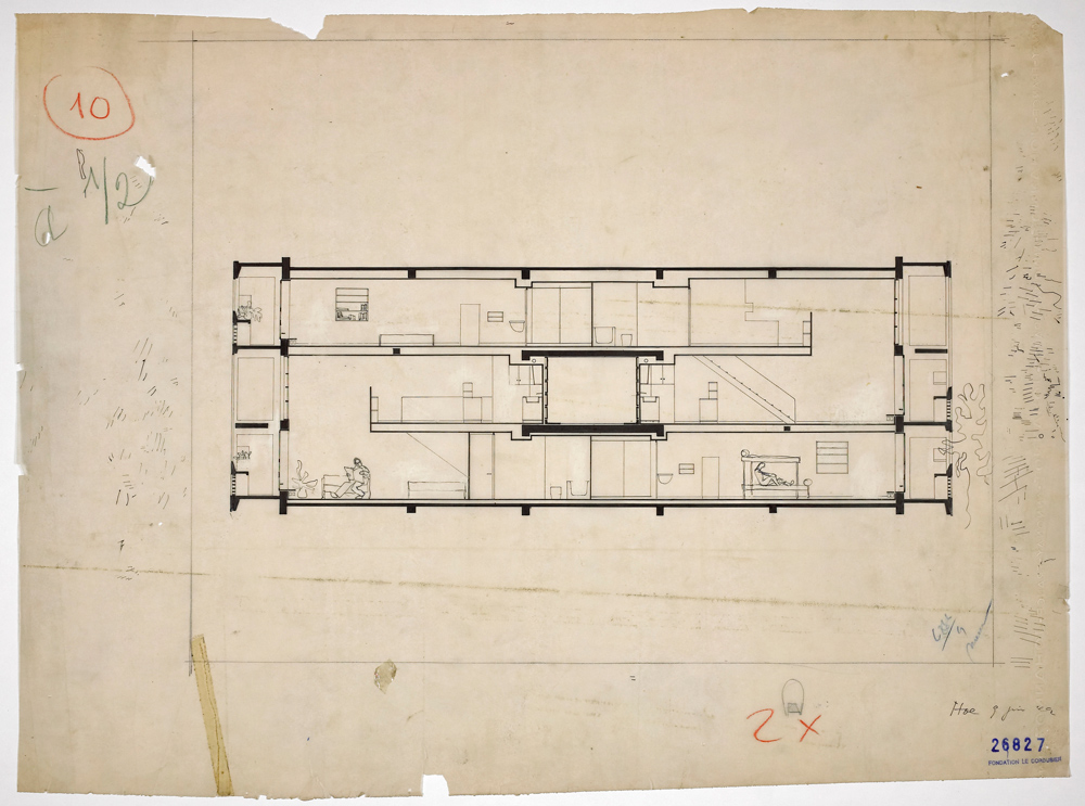
The original design (borrowed from Russian architects; see Frampton's Modern Architecture) was quite clever and remains a fascinating prototype.  Practically every student of architecture studies it and designs a variant.  The appeal of Le Corbusier's design is that it's very efficient but also very humane.  Because of the sectional composition (see image below) each unit is allowed to have a "double orientation"—east and west in Le Corbusier's case—whereas a typical plan with a double-loaded central corridor gives units access to only one orientation, single-aspect.  In Le Corbusier's design, each unit also has a double-height living room.  And because the central corridor is only needed on every 3rd floor, the building becomes quite efficient (although it is inefficient for each unit to have its own staircase within).  

From www.dezeen.com

From www.dezeen.com

Le Corbusier oriented the Unité d'Habitations—all of them—to face east and west (as I explained in Le Corbusier and the Sun and Zeilenbau orientation and Heliotropic housing).  This is somewhat problematic, as half the units have their double-height space dark in the mornings, the other half dark in the evenings.  Nobody gets the excellent south exposure, and shading is very difficult on the east and west.  For general energy efficiency, a long, narrow building ought to face south.  If you simply rotated Le Corbusier's design 90 degrees, half the residents would have their living rooms facing north and be sequestered to a kind of 'thermal ghetto' (see Public Housing and the ‘Thermal Ghetto’).

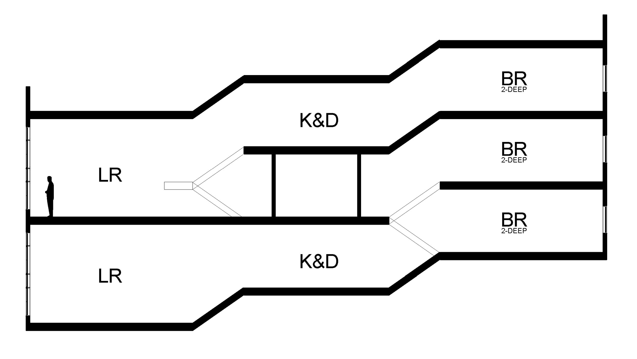
So how could the Unité d'Habitation concept be refined, to be rotated 90 degrees, and give each unit access to the sun?  Here's my rough idea.  South is to the left.

©Anthony Denzer

©Anthony Denzer

This creates a 4-bedroom unit, and a 2-bedroom unit, each having a 1.5-height living space (LR) facing south.  Of course it could also be imagined as two 3-bedroom units with three-dimensional interlocking.  In any case, balconies and shading could be added.  Kitchens and dining areas (K&D) are 'buried' in the center of the building, though I think these spaces would have a view of the sky through the living room and in winter the sun can penetrate deep.  Bedrooms face north.  (The section has no depth, so the bedrooms indicated are two-deep.)

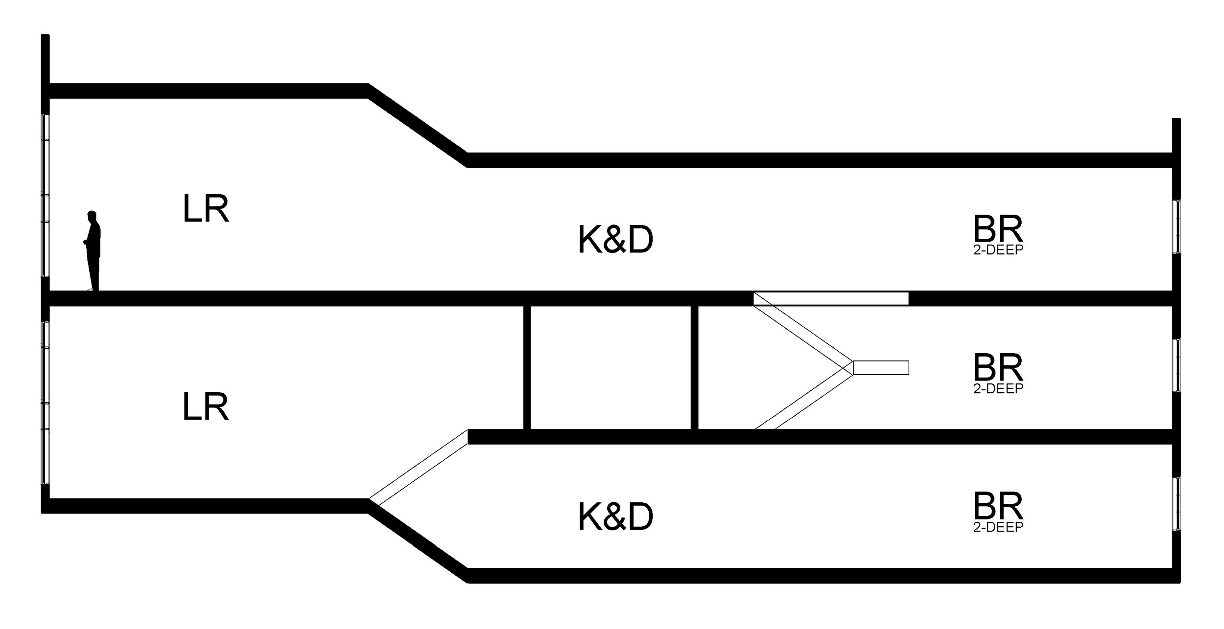
This scheme retains the value of a central corridor on every 3 floors.  And, as in Le Corbusier's design, each unit has cross-ventilation.  Emergency egress issues have not been resolved.  Above, the sloped lines represent stairs; they could alternatively run perpendicular to the section view as shown here: 

©Anthony Denzer

©Anthony Denzer

Worth developing?  Comments welcome!

●          ●          ●

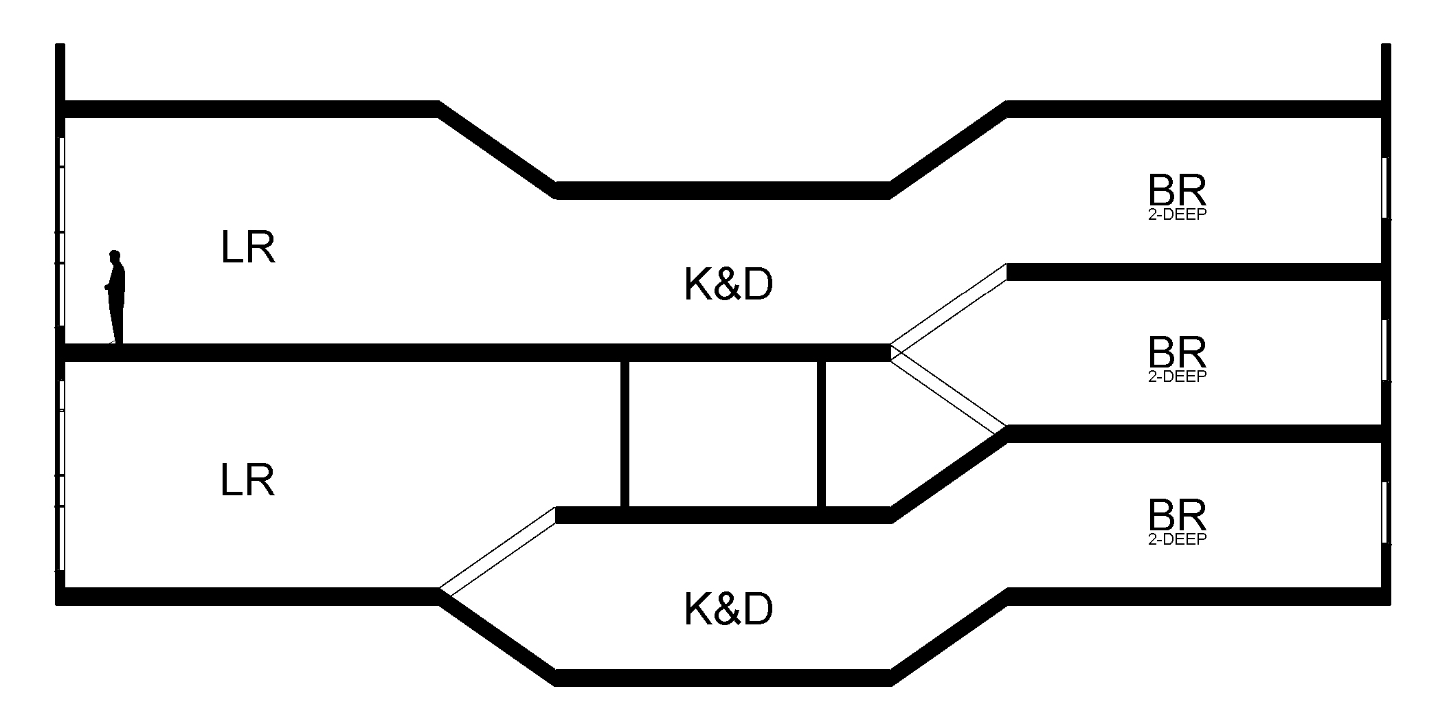
Edited to add:  A friend suggested ascending from the living room to the bedrooms, rather than descending.  It would be nice to look down to the landscape from the kitchen & dining area. Here's how that would look:

©Anthony Denzer

©Anthony Denzer

More variants based on feedback:

©Anthony Denzer

©Anthony Denzer

©Anthony Denzer

©Anthony Denzer

As explained in the excellent Single Aspect Blog, this form is known in Europe as the "scissor maisonette" or "scissor block planning." Here I’ve learned that the 'ascending' scheme above unknowingly recapitulated a 1960 Kenneth Frampton housing block in London, though Frampton's building was oriented facing east and west.