The 1975 PPG Solar Center

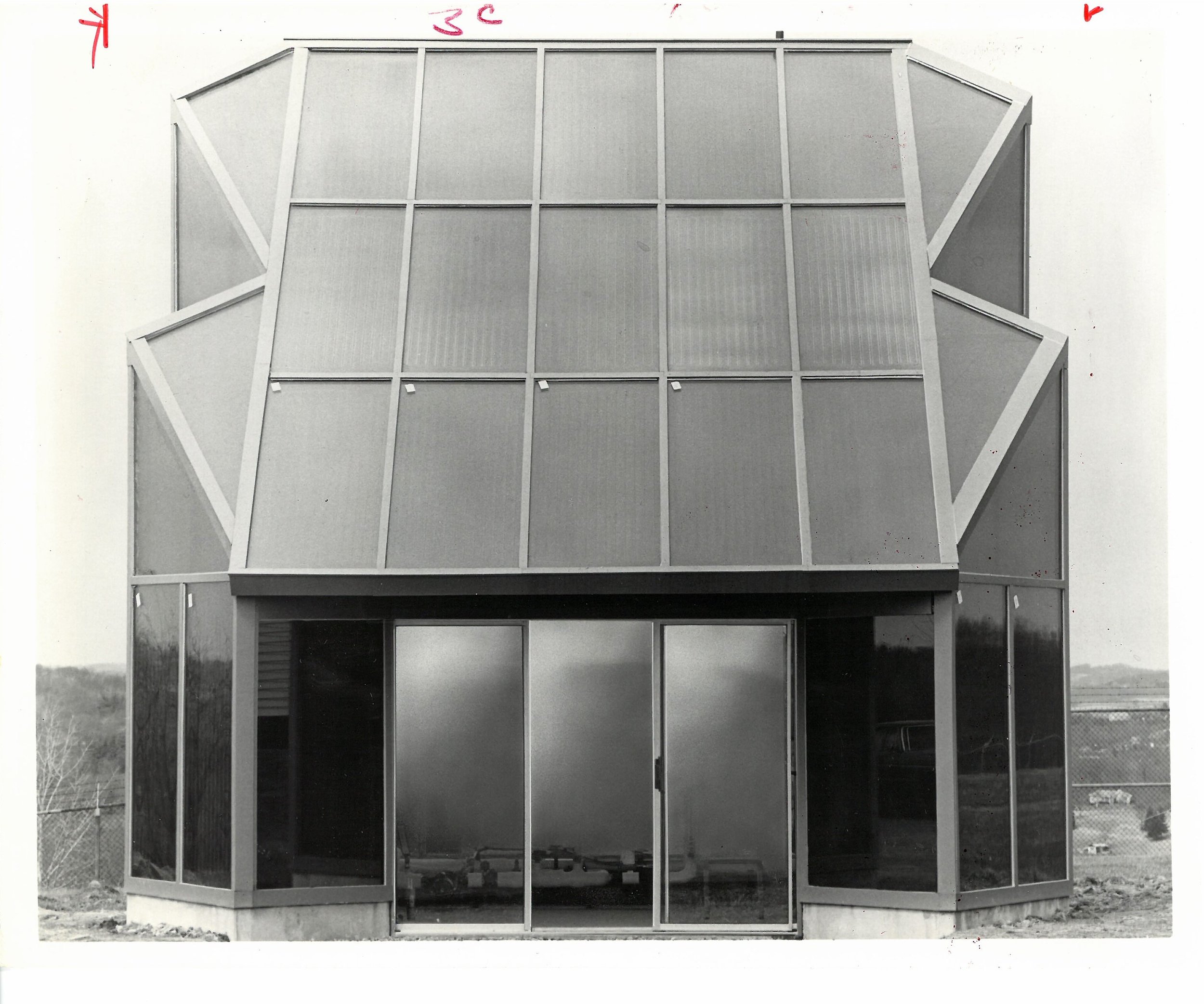
Here's a remarkable building from the history of solar architecture, about which very little is written: The PPG Solar Center (1975) in Harmarville, Pennsylvania.  I recently obtained this photo.

This is striking.  What a remarkable strength of form and appearance.  Is it fair to say, menacing?  At a glance, you might be inclined to think this is a photo of an architectural model, but looking carefully at the photo, you can see that it's a real building.

The building's concept may come as a surprise: it was intended to test the possibilities for solar skyscrapers.  Basic facts are given in the short Houston Chronicle article pasted to the reverse side of the photo:

SUN MAY 4 1975
NEW SOLAR CENTER
Scientists are monitoring this model energy building at PPG Industries' Harmarville, Pa., research center as a prelude to construction of "solar skyscrapers." This one-and-a-half story structure, which has 27 solar collectors in its roof and walls, is a project of Aluminum Co. of America, Oliver Tyrone Corp., Phelps Dodge Brass Co., Standard Oil Co. of Ohio, Sun Oil and PPG. The project is to demonstrate that solar energy systems can help furnish heating, cooling, and hot water for office and commercial buildings. The projects next phase is construction of an actual sun-fueled office building.

Several other newspapers in the Northeast published the same photo and identical article.  An earlier Associated Press article had reported on the corporate partnership and plans for the structure; it was illustrated with an uncredited drawing of a solar skyscraper reminiscent of the Citicorp Center (New York, 1977, architect Hugh Stubbins).*

William Shurcliff included the PPG building in his Solar Heated Buildings: A Brief Survey (13th ed.); it was titled "Learning Model of Tall Office Bldg."  Shurcliff reported full technical details; the system used established technologies and products and proven methods.  It seems to have been a demonstration more than an experiment.

It does not seem this project was directly related to the Citicorp Center, which had a 45° sloped roof intended for solar collectors, a roof form which remains a characteristic feature of the New York skyline.  Citicorp's solar system, which was not built, would have produced hot water, to be used to dehumidify air and reduce cooling energy.  An MIT report on the Citicorp solar system mentions PPG as a manufacturer of flat-plate collectors but does not mention this prototype project.  And Shurcliff's account of the PPG project (also 1977) does not mention Citicorp, and describes the PPG project as a "pilot project for a later moderate-size bldg. and a still later 6-10-story office bldg."

Nowhere do I find the architect credited.  This is unfortunate, because, again, the photograph offers one of the most vigorous and original aesthetic statements in the history of solar architecture.

*printed in the New York Times, August 31, 1974.

Mies vs. Stirling in London

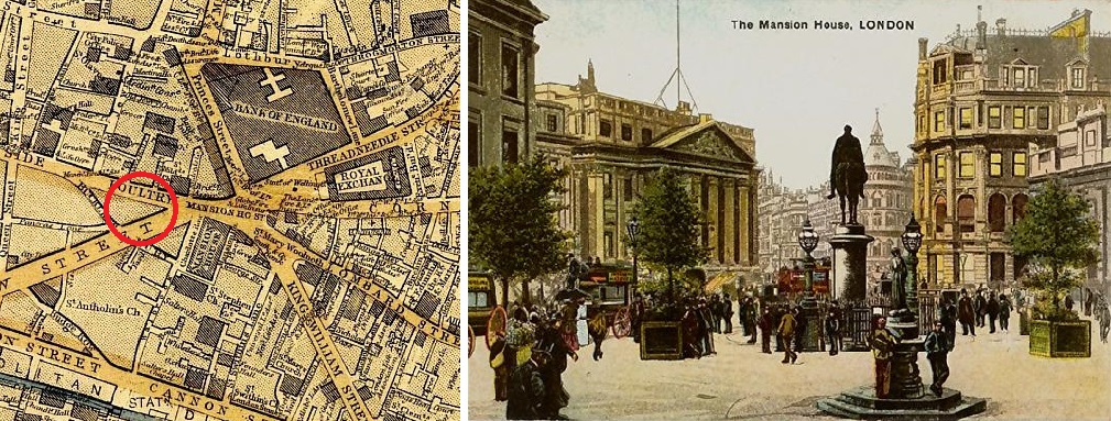
Last month I visited the exhibition Mies van der Rohe and James Stirling: Circling the Square, at RIBA's Architecture Gallery.  It was meant to illustrate the contrasts between two schemes for Mansion House Square, one of London's most prominent sites (see below).  It also raised some much bigger questions.

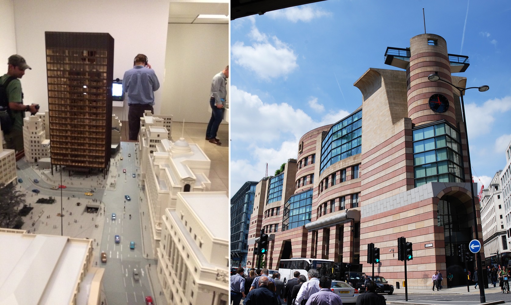
Mies' design, developed between 1963-69, offered London a glass tower and a large empty gridded public space---typical Mies but quite unusual for London.  It was not built.  Stirling's project, called Number One Poultry and designed between 1985-93 on a more modest footprint, was built and stands as an exemplar of Postmodern architecture (right below).  The RIBA exhibit featured a large model of Mies' design (left below), dozens of sketches and drawings from Stirling, and many period documents about the political machinations that unfolded.

Left: RIBA exhibit. Right: Number One Poultry. Photos by Anthony Denzer

Left: RIBA exhibit. Right: Number One Poultry. Photos by Anthony Denzer

Part of the importance of the RIBA exhibit is that Mies' design is not well known.  As Jack Self wrote in The Guardian:

"every architect over 40 in Britain has a strong opinion about the work. And yet these views are often held with almost no knowledge of what was actually designed as very little information about the work has existed in the public realm, until now."

A major strength of Mies' design, which has gone unnoticed I think, was its attention to the nearby church of St. Stephen Walbrook, a masterpiece by Sir Christopher Wren.  In the model photo below, you can see the Wren church at the bottom-left.  It would have been given a prominence which today it unfortunately does not enjoy.

Mies van der Rohe's design for Mansion House Square. Image from The Guardian.

Mies van der Rohe's design for Mansion House Square. Image from The Guardian.

Why was Mies van der Rohe's project rejected?  Firstly, the politics of public space.  Self's Guardian article cited above also includes some excellent historical context about the "tumultuous" political atmosphere in London in the Thatcher era.  Mies' monumental public space would certainly harbor political protests.  This could not be tolerated, Self concludes, so the Mies project was killed.

Secondly, Prince Charles inserted himself in the process.  In 1984, 15 years after Mies' death, Mansion House Square was still under consideration.  Then the Prince of Wales gave a famous speech (which the RIBA curators displayed), including his view of the Mansion House plan:

"It would be a tragedy if the character and skyline of our capital city were to be further ruined and St Paul's dwarfed by yet another giant glass stump, better suited to downtown Chicago than the City of London."*

Was Prince Charles later satisfied with the Postmodern replacement?  No.  In his book A Vision for Britain (1989) he said Stirling's design "looks rather like an old 1930s wireless."  And, in reference to the platforms pictured above, he asked: "Is somebody proposing to dive from this tower?"

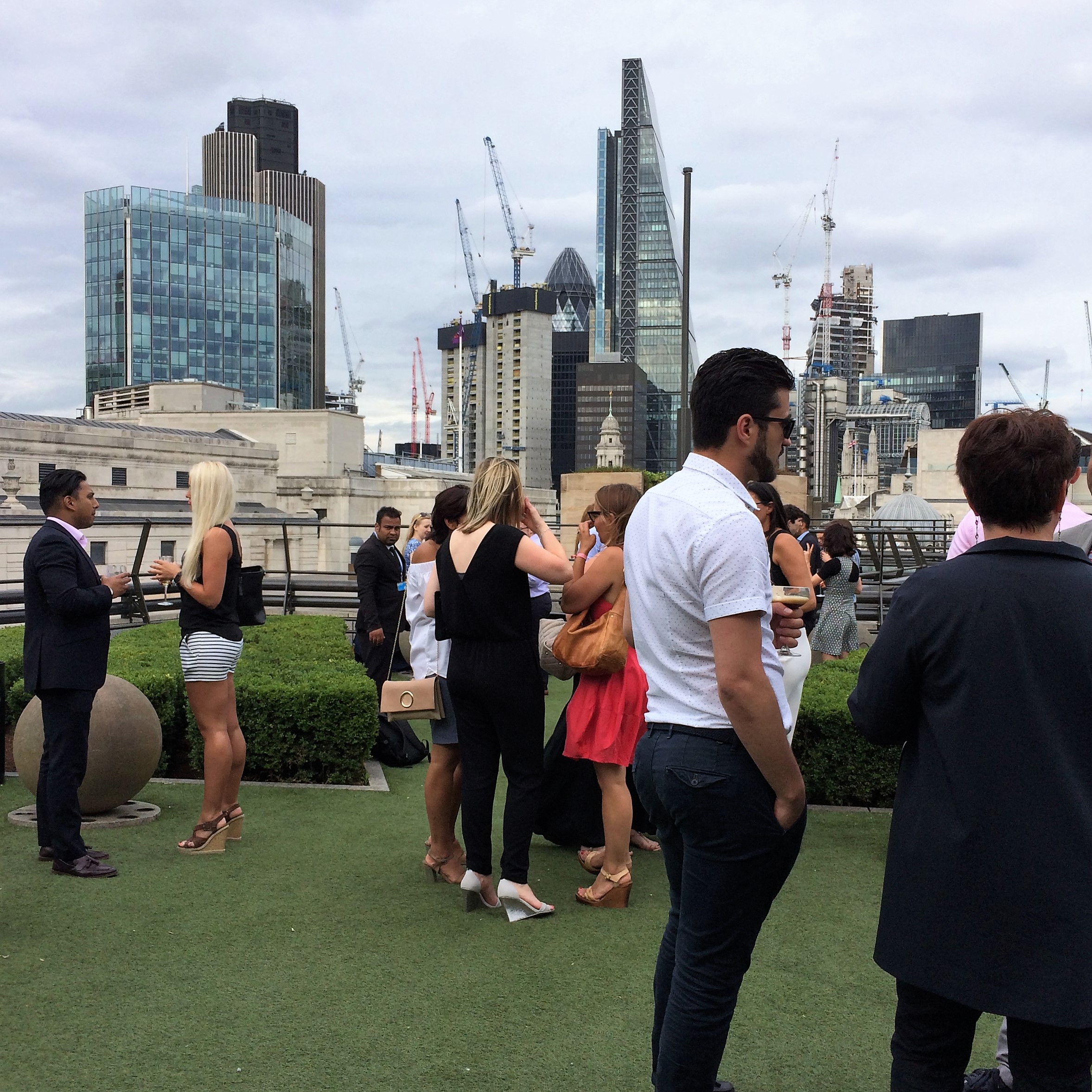
Instead of a monumental plaza, Stirling's building has a rooftop restaurant/bar, and an observation deck with plastic grass (see below).  On a warm June Friday evening, I went there to see the site from above and reflect on what I'd learned at the exhibit.  The rooftop was packed with young professionals enjoying not only their beverages but also, clearly, the building and its spaces, as well as the transformation of London in the background.  I realized that RIBA mounted this exhibit just in time, for a new historical moment when Postmodern isn't a dirty word the way it certainly was a few years ago. 

Rooftop terrace at Number One Poultry. Photo: Anthony Denzer.

Rooftop terrace at Number One Poultry. Photo: Anthony Denzer.

In the book London’s Contemporary Architecture: An Explorer’s Guide, Ken Allinson and Victoria Thornton wrote: "One Poultry was already incongruously at least ten years out of fashion when completed."

I expect the RIBA exhibit will raise the profile of Number One Poultry and open the door to a new appreciation for Stirling.  But it also revealed the political conservatism that underwrote Stirling's project, and that's something you can't tell just by looking at it or by enjoying a cocktail on the roof.

And finally, was London deprived of a great building and a great public space?  Naturally, the RIBA exhibit implicitly raised that question but made no explicit attempt to answer it.  In my view, a moment of some relief from the congestion and visual chaos, as Mies projects provide, would be welcome in the Bank district.  (This is partly why Wren's city church interiors are so pleasurable.)  Moreover, as a record of architectural history, London has few great high-modernist buildings from the 1950s-60s.  So I am inclined to say yes, it was a missed opportunity when Mies' plan was finally rejected.

●          ●          ●

*Full text of speech here.  This was the famous "monstrous carbuncle" speech.  In black tie, Prince Charles memorably disparaged a high-tech design by Peter Ahrends for the extension of the National Gallery:

"What is proposed is like a monstrous carbuncle on the face of a much loved and elegant friend." (video link)

In a witty nod to Prince Charles' remark, a British magazine now awards the Carbuncle Cup annually to "the ugliest building in the United Kingdom completed in the last 12 months."

Art Nouveau and Modernisme

Each summer I visit Barcelona, Paris, and London with students, and particularly in Barcelona and Paris, I always gain a deeper appreciation for Art Nouveau. Art Nouveau was a bit of a blind spot in my own education, I now realize. I’ve included Horta & Guimard in my classes for years, but it's been a pretty superficial treatment. I’ve treated Sullivan and Gaudí as related but in categories of their own.

In Barcelona/Catalonia, so I’ve learned, their term for Art Nouveau is Modernisme. This is a direct translation; see the brochures from the St. Pau Hospital below. 

A large part of Barcelona, the Eixample district, is full of wonderful buildings in the Modernisme/Art Nouveau style. Indeed, this is what makes Barcelona so satifying to visit: the quality of the ‘background’ buildings is exceedingly high.

Barcelona Modernisme.JPG

Barcelona’s Modernisme is distinctive from the Art Nouveau of Paris or Brussels because it includes more Neo-Classical and Neo-Mudéjar influences, as well as the local influence of Gaudi. But it is clearly part of the same movement using new forms of decoration with floral patterns, ironwork and ceramics.

Hospital de Sant Pau by Lluís Domènech i Montaner; https://flic.kr/p/DLBNCC

Hospital de Sant Pau by Lluís Domènech i Montaner; https://flic.kr/p/DLBNCC

I think Catalonian architects and historians are proud of the term Modernisme, and unhappy that it was usurped by the concept of Modernism. Of course Modernism is quite different from Modernisme.

This also points to the fact that Art Nouveau was a worldwide movement which not only took different forms in different places, but also different names. The UNESCO World Heritage Site nomination for The Works of Antoni Gaudi (1984) makes this point:

“[Art Nouveau was] an authentically creative movement, an international phenomenon distinct from the historicism of the 19th century. It is characterized by the return to natural forms, merged, without prejudice, with the inherited formulas of the past and known by several different names: Art Nouveau, Jugenstil, Liberty, Floreale, Modernism[e], etc.”

Here's the Wikipedia page for Modernisme

And, somewhat obliquely, here's how Sir Nikolaus Pevsner described Gaudí’s relationship to the Art Nouveau:

“Gaudí’s architecture poses even more urgently the problem of how far Art Nouveau as a term with an analyzable, useful meaning can be stretched. That he is first and foremost Gaudí there can be no question.”

A Note on Green Building Aesthetics

Earlier this week Lance Hosey stirred up some debate with his Huffington Post piece called "Architecture’s Great Divide."  He was responding to Aaron Betsky's provocation in Dezeen: "There should be no top 10 prizes for sustainable architecture."

Briefly, Betsky says that the AIA-COTE Top Ten consists of banal, mediocre buildings.  Hosey rebuts Betsky's points one-by-one, concluding that it's "a false dichotomy" to pit aesthetics against performance. (Additionally, Lloyd Alter weighed in here.)

And similarly a few weeks ago, there was some heavy debate on Twitter after Alexandra Lange called the Cornell Tech tower "so blah."  I basically agree, but I made this point: "At least 80% in every category/genre is ugly or compromised but for efficient buildings this is, somehow, always seen as an inherent, defining problem..."

What I usually find absent from these discussions is the acknowledgement that aesthetic judgments are conditional, not absolute.  This often happens to me: A building (or work of art) might be "blah" or ugly on first view, then I find it beautiful when I learn more about it and revisit it.  Sometimes, someone else shares an insight that I missed.  My initial aesthetic reaction is superficial, but then with more perspective my appreciation changes. 

For green buildings, this is particularly germane because many 'sustainable' features are not immediately apparent.  It's likely impossible to see indoor air quality, or radically low plug loads, or zero waste, in architectural photography or a quick visit.  Do these things contribute to beauty?  Of course!  Beauty is more than skin-deep; it includes character.  We form judgments about people this way; Mother Theresa was beautiful, right?  In the same way, for me, a building's low energy use (or other unseen green feature) is an aspect of its beauty.

That said, I think I understand and sympathize with Betsky's complaint.  He has sensed, correctly, that most green building award-winners share a style: bland corporate modernism with a small dose of high-tech.  This style is not, by now, visually experimental or risk-taking.  And for those who aren't engaged by this style, or who are oriented to the next avant-garde, it's easy to understand that the awards are not going to be rewarding.

●          ●          ●

Previous blog posts which discuss aesthetics vs. performance:
A few thoughts on the Architecture of Energy-Efficiency
Is your window "thermally desirable"?
The Saskatchewan Conservation House: Aesthetic Questions
A note on the solar architecture of the 1970s

Solar Jobs, 1978

In March 1978, a Congressional Subcommittee chaired by Senator Edward M. Kennedy held hearings on the subject: "Creating Jobs Through Energy Policy."

Some of the most provocative testimony came from William Winpisinger, the President of the International Association of Machinists and Aerospace Workers:

"We have a tremendous opportunity to dovetail the development of the new energy sources such as solar, cogeneration, biomass, small hydro, and wind with a national manpower policy and full employment program."

"We must be wary, however. The giant energy companies, already vertically and horizontally integrated, are casting covetous eyes upon the alternatives, particularly solar, and I guess staking out a claim on buying the sun. I don’t think we can permit that to happen. Of all sources, solar power must be the people’s power."

"It remains for public spirited and progressive citizens to remind the nation’s policy makers and the public, that the sun and solar energy belong to the people, not the energy companies; that the waters of the ocean and rivers belong to the people, not the monopolies; that the children of the ghettos have as much claim to ownership of pubic lands, oil shale and offshore oil deposits, as do a few private investors."

The next month, in April 1978, Winpisinger led the founding conference of the Citizen-Labor Energy Coalition (CLEC), with Heather Booth.  CLEC promoted energy-efficiency and solar jobs, based on the larger belief that "the energy crisis ... pitted the well-being of workers and consumers against corporate power and profits" (Andrew Battista, "Labor and Liberalism: The Citizen Labor Energy Coalition," Labor History, 1999).  CLEC gained a bit of political power in the early 1980s.  For a critique, see the 1984 Heritage Foundation report: "CLEC: Hidden Agenda, Hidden Danger" (pdf).  CLEC also gets mentioned in pieces such as "Obama’s Radical Past." 

Winpisinger was known as "Wimpy."  When he died in 1997 the New York Times said he called himself a "seat-of-the-pants socialist."

●          ●          ●

Also in 1978, a group called the Mid-Peninsula Conversion Project in Mountain View, California, issued a report called "Creating Solar Jobs" (pdf).  It estimated 66,300 direct solar jobs in the United States by 1985.  This study also estimated the costs for a statewide program to build and retrofit passive solar houses in California in the 1980s, and the construction jobs which would be created.  "We can assume conservatively that 10% to 20% of the single-family homes and 5% to 10% of the multi-family homes could be retrofitted by 1985 with a south-facing greenhouse or solar wall."  The nascent PV industry was also analyzed.

See also: Nixon's Energy Policy