The House of Tomorrow Postcard

This wonderful postcard presents a bundle of unanswered questions.  It depicts George Fred Keck's 1933 House of Tomorrow at the Century of Progress International Exposition (or world's fair) in Chicago. 

In The Solar House I discuss this building in great depth as the site where Keck "discovered" passive solar heating, and subsequently began a decade-long journey to develop the solar house.  (I also note that Keck probably turned a blind eye to the house's summer overheating problems when he later constructed the solar house legend.)

The mystery is, who painted this watercolor?  This image shows excellent technique, and Fred Keck was a quite accomplished watercolorist himself.  You can find one example of Keck's fine brushwork---the Coronet house---in my book.  Keck's archive at the Wisconsin Historical Society in Madison has dozens of watercolors, mostly abstracts but some architectural illustrations.

I do not believe Keck created this painting.  The postcard does not credit the artist explicitly, although a faint maker's mark can be detected in the lower right just beneath the automobile (a Pierce Arrow?).  The name seems to read Heiling, or Helling.  I think the most likely explanation is that the artist was an in-house employee of Reuben H. Donnelley, working from Keck's drawings or a picture of a model.

Another mystery is why the penthouse-level is shown with the exterior skin of glass set deeply beneath an overhanging roof slab.  In the completed house (see here), the upper glass wall is located at the outer edge of the roof slab.  Is it possible that Keck's original design intended to have the glass in the location shown here?  (I did not find any archival documents showing this configuration, but I'm not sure I have been able to find everything in Keck's archive.)

In any case, it's a striking image of a vision of the future, rendering the glass house as crystalline and reiterating a theme which was central to early modern architecture.

See also: 80 years: The House of Tomorrow
See also: Keck Resources

2014: On the Blog

Solarhousehistory.com had just over 10,000 pageviews in 2014!  Thank you!

The three most popular pages were:
1. Homepage (1,513 views)
2. About the Book (1,189)
3. Resources (1,135)

What were the most popular topics on the blog?
1. Le Corbusier and the Sun (807)
2. Public Housing and the ‘Thermal Ghetto’ (403)
3. Tuberculosis and Solar Architecture (part 2) (345)
4. Using an Art Museum (310)
5. The Roman Baths and Solar Heating (263)
6. Solar Orientation and Historic Buildings (256)
7. Reyner Banham's Unwarranted Apology (213)
8. Zeilenbau orientation and Heliotropic housing (181)
9. 80 years: The House of Tomorrow (156)
10. Tuberculosis and Solar Architecture (part 1) (155)

Here's to more great content coming in 2015!  Please continue to link and share.

The Saskatchewan Conservation House: Aesthetic Questions

As I've mentioned before (here), I'm interested in the aesthetics of solar architecture as it developed in the 1970s.  In The Solar House I note that 1970s solar houses can be associated with "the aesthetics of the counterculture," or alternatively with the anesthetic approach of a science experiment.  I think there's a case to be made that the 'eccentric' architecture of that period may have created a negative stigma for the solar house movement. 

The Saskatchewan Conservation House, by Robert Besant & others (1977)from http://www.greenbuildingadvisor.com/blogs/dept/musings/forgotten-pioneers-energy-efficiency

The Saskatchewan Conservation House, by Robert Besant & others (1977)
from http://www.greenbuildingadvisor.com/blogs/dept/musings/forgotten-pioneers-energy-efficiency

But what do younger people think?  If they didn't live through that period, do they have that same sense of a hippie- or science-experiment-architecture which is easily stereotyped and ridiculed?

To probe these questions, I asked some students to examine the Saskatchewan Conservation House and record their reactions.  (Admittedly, this is not exactly a classic example of the type---it's more properly a superinsulated house, with much less glass than a typical solar house---but it does embody many of the aesthetic issues in question.)

Here are some selected responses from my undergraduate students:

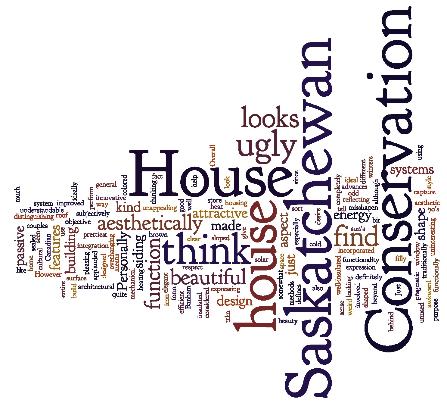
• • • "I think that the Saskatchewan Conservation House couples form with function, and although it is not aesthetically ideal, the shape of the house is pleasing since it is clear in its functionality.  Just as Banham applauded the integration of mechanical systems into the design of a building, passive systems can also be made into distinguishing architectural features."

• • • "Personally I think that the Saskatchewan Conservation House is kind of ugly but it is understandable how it looks.  Overall the house is very uninteresting aesthetically."

• • • "The Saskatchewan Conservation House is functionally beautiful but aesthetically ugly.  It's just made to perform well in the energy aspect, not aesthetic or cultural aspect."

• • • "The house is expressing what it is: a well-insulated house that is using a solar heating system."

• • • "Personally, I find the Saskatchewan Conservation House to be attractive in a weird kind of way.   I like how the function of the building defines the shape."

• • • "The Saskatchewan Conservation House is considered to be an icon for [its advances in] fully insulated and sealed housing.  In that respect the house is beautiful because there was innovative thinking involved."

• • • "I find it to be quite ugly.  It's not just the Saskatchewan Conservation House but the entire 70's style of overhanging unused space I find completely unappealing."

• • • "I don't find it especially attractive.  However, the fact that it is designed behind some sort of general purpose or function does give it its own sense of beauty."

• • • "The Saskatchewan Conservation House is not traditionally beautiful.  The awkward shaped roof and the sloped surface aren't ideally good looking."

• • • "I do think the looks of the house could have been improved with different colored siding and window trim."

• • • "Subjectively, I think the Saskatchewan Conservation House isn't the prettiest house I've seen.  It looks somewhat misshapen, and the use of that ugly brown siding doesn't help.  There isn't much expression in the house beyond a pragmatic desire to capture the sun's heat and store it against the cold Canadian winters."

• • • "It doesn't have any elegant features."

• • • "I think the Saskatchewan Conservation House definitely looks a bit odd but I don't think it is ugly by any means.  You can tell its look is reflecting the design objective, which was to build an energy efficient home that incorporated passive methods."

See also: Resources on the Saskatchewan Conservation House

The "Surprisingly Sophisticated" Fallacy

Earlier this month I noticed, twice, writers describe pre-modern* architecture as "surprisingly sophisticated."  This caught my attention in part because I was just wrapping up an experimental seminar course which explored how pre-modern architecture worked in terms of heating, cooling, lighting, and structural systems.  We looked at a lot of sophisticated pre-modern buildings; it stopped being surprising pretty quickly.

On Treehugger.com, in an article called "What is a smart home anyway?", Lloyd Alter—who I respect quite a lot—said the Native American wigwam was "surprisingly really sophisticated" because of its layered insulated wall system and central heat source.

I replied in the comment section:

"Good subject! I just finished teaching a class on what can be learned from pre-modern buildings. The word "surprisingly" strikes me funny because we found pre-modern buildings to be consistently intelligent and clever, given the tools available. But ultimately we concluded these kinds of buildings, while fascinating, should not be romanticized. They allowed survival, perhaps barely. (Think about the air-quality!)
It's important to acknowledge that life improved tremendously in the machine age, even as we proceed with course-corrections."

Then some other commenters also chastised Alter for the word "surprisingly," and to his great credit he rescinded it, as the page now shows.  (Nobody disagrees with the word sophisticated.) 

Then in a (completely unrelated) New York Times op-ed called "How to Rebuild Architecture," Steve Bingler and Martin C. Pedersen offered a critique of contemporary architecture by claiming:

"For millenniums, architects, artist and craftspeople — a surprisingly sophisticated set of collaborators, none of them conversant with architectural software — created buildings that resonated deeply across a wide spectrum of the population."

I'm calling it the "Surprisingly Sophisticated" Fallacy.  You're only surprised if you presume that people from the past were less intelligent than us today—and that's a basic error of historical thinking, because they certainly were not.  Again, it doesn't take much exposure to history before getting this.  A few minutes with the Parthenon will do.  You can certainly call old buildings or old practices sophisticated, just don't act surprised.

Incidentally, Aaron Betsky wrote a scathing retort to Bingler and Pedersen's larger argument, and though he didn't exactly address my point head on, he reacted to the passage above by saying: "I do not know what fantasyland these authors live in."

Finally, to forestall any misunderstanding, none of this contradicts the undeniable fact of technological progress.  A house built today is more technologically sophisticated than a wigwam or country manor, because materials, tools, and techniques generally get better as time accumulates.  And this progress is clearly reflected in our excellent standard of living.  We should not, however, take that to mean that we're more intelligent, or that people in past periods were less capable.  They were invariably clever!

*In the class we generally took "pre-modern" to mean those buildings built before central heating, or air-conditioning, or electric lighting (depending on which subject we were interested in at the moment).

Unearthed: MIT Solar House IV film

More and more every day, valuable archival material is being digitized and made available on the web.  Sometimes this leads to exciting discoveries for people like me.  Here's an example.

British Pathé, a newsreel company, recently put thousands of their historical films on YouTube.  Openculture calls it "a goldmine of footage."

One of their films features MIT's Solar House IV, built by Hoyt Hottel, Lawrence B. Anderson and their team in 1957-58.  It's short, but significant.

Solar House IV is discussed in great detail in The Solar House.

Related: Hoyt Hottel's skepticism