Trombe Parapets

Here's a wonderful example showing that it pays to know your history: The "Trombe Parapets" created for a new project called The Pavilion at Colorado State University in Fort Collins.

Most readers will probably know that a Trombe Wall is a mass wall (usually concrete) placed a few inches behind glass.  Solar energy is stored in the mass, and radiates slowly to temper the room behind.  In The Solar House I reconstruct the history of the Trombe wall, so-named for French engineer Felix Trombe.  (He built the first storage-wall house in Odeillo, France, in 1956, though MIT scientists had tested water-storage walls in 1946.  Douglas Kelbaugh probably coined the term "Trombe Wall" in the 1970s.)

This new application---the Trombe Parapet---is exactly as the name suggests: a small Trombe Wall placed above the roofline.  You can see the Trombe parapets in the image below at the upper left part of the structure.

from http://www.csupavilion.com

from http://www.csupavilion.com

A traditional Trombe Wall occupies the South side of a building, and this is an inherent limitation, as views from the interior in that direction may be obscured or limited.  The Trombe Parapet is here placed on the North wall of the building, still facing South, in a location where the occupants are not affected.

And, a traditional Trombe Wall works principally by radiation and natural convection, as the mass wall directly faces the space that it is intended to heat.  In the Trombe Parapet, the mass wall is located in an unoccupied part of the structure, relying on forced air convection to transfer the heat from the storage wall to the spaces in the building.  As the diagram above implies, there is some fan power required because the hot air must be moved downward while cool air is drawn up.  Therefore Trombe Parapets are limited in their efficiency and they are not strictly passive.

Also of note: the more prominent feature in the foreground of the image above is a Katabatic Tower.  This uses evaporative cooling and natural convection to cool the building in summer.  Katabatic means the downward flow of cold air.  This feature (not novel to the CSU Pavilion project) is based on older historical technology.  Similar cooling towers were popular in dwellings in the Middle East in the 18th and 19th centuries.

I learned about this project at the Biennial Conference of the USGBC Wyoming Chapter last fall.  The presenters were: Marc Snyder of 4240 Architecture, Linda Morrison of Ambient Energy, and Dennis Rudko of Cator Ruma & Associates.  As far as I know, these designers created the concept and the name "Trombe Parapets."

Image credit: https://www.usgbc.org/articles/top-10-states-2015-pavilion-laurel-village-csu

Image credit: https://www.usgbc.org/articles/top-10-states-2015-pavilion-laurel-village-csu

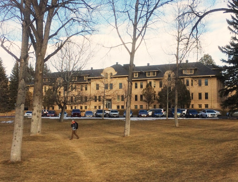
Hoyt Hall, University of Wyoming

The Alliance for Historic Wyoming asked me to write about a favorite building. They published it here. (Please visit them, and join or donate!) Some of it was edited for length; here's the full version.

When I arrived at the UW campus in Laramie ten years ago, like everyone I was immediately struck by the picturesque beauty of Prexy's Pasture and the ensemble of buildings surrounding it. What a wonderful harmony between architecture and landscape we enjoy! Yet I must confess that no individual building impressed me as truly excellent in and of itself.

And then I explored further and encountered Hoyt Hall. Hoyt grabbed me instantly, and all these years later I still believe it's the most interesting building on campus. I go out of my way to walk by it almost every day. Hoyt was built as a womens’ dormitory between 1916 and 1922; the architect was William Dubois of Cheyenne. It was named to honor of Dr. John W. Hoyt, UW’s founding president.

Why do I love it? Hoyt Hall is simply a beautiful architectural composition. Dubois designed a façade with a wonderfully complex and balanced rhythm. The vertical divisions and subdivisions are endlessly fascinating to study, in the same way English majors might analyze a poem by Keats. (I made a diagram to help explain this.)

The proportions, to my eyes, are excellent; that extra bit of solidity at the end of the wall, for example, is just right. And look at the vertical movements! How perfect that the Prairie-Style horizontal roofline is broken in three places, by the peculiar Mission-Style parapets that had no precedent on campus or in the area.* And how clever that the roofline was not broken where the bay windows thrust upward, resolving themselves in attic-level dormers. In 1922 this was stylish and innovative, yet deeply classical.

The backside exhibits a different and complementary hierarchy. The main public space, wrapped in glass, is allowed to step forward in an honorific manner. If the building is a symphony, this is the intermezzo. I expect this was originally the ‘living room’; it’s now an especially-habitable conference room. 

And I wonder, as I walk behind Hoyt, if the fire escapes were part of the original design, or a later modification. I can see bold 1920s women hanging out on these makeshift terraces on warm evenings. I’m sure young men reenacted Romeo and Juliet from below. I imagine how Edward Hopper might have painted such a scene.

Now, Hoyt Hall has not been well-loved, and the interior spaces are relatively miserable for academic use today. It's a difficult place to work, and certainly needs to be better-insulated for comfort and energy use. That will change soon; the University has commissioned a modernization. I'm confident the architects will preserve Hoyt’s remarkable design quality, while giving my colleagues a better place to work. I hope those evocative fire escapes will survive.

●     ●     ●

*In the region, Mission-style parapets are also found on these buildings:
     ● Lennox House, Colorado Springs, Colorado (1900)
     ● Northern Pacific Railroad Depot, Bismarck, North Dakota (1901)
     ● Union Station, Billings, Montana (1909)
     ● Holdrege train station, Holdrege, Nebraska (1910)

The House of Tomorrow Postcard

This wonderful postcard presents a bundle of unanswered questions.  It depicts George Fred Keck's 1933 House of Tomorrow at the Century of Progress International Exposition (or world's fair) in Chicago. 

In The Solar House I discuss this building in great depth as the site where Keck "discovered" passive solar heating, and subsequently began a decade-long journey to develop the solar house.  (I also note that Keck probably turned a blind eye to the house's summer overheating problems when he later constructed the solar house legend.)

The mystery is, who painted this watercolor?  This image shows excellent technique, and Fred Keck was a quite accomplished watercolorist himself.  You can find one example of Keck's fine brushwork---the Coronet house---in my book.  Keck's archive at the Wisconsin Historical Society in Madison has dozens of watercolors, mostly abstracts but some architectural illustrations.

I do not believe Keck created this painting.  The postcard does not credit the artist explicitly, although a faint maker's mark can be detected in the lower right just beneath the automobile (a Pierce Arrow?).  The name seems to read Heiling, or Helling.  I think the most likely explanation is that the artist was an in-house employee of Reuben H. Donnelley, working from Keck's drawings or a picture of a model.

Another mystery is why the penthouse-level is shown with the exterior skin of glass set deeply beneath an overhanging roof slab.  In the completed house (see here), the upper glass wall is located at the outer edge of the roof slab.  Is it possible that Keck's original design intended to have the glass in the location shown here?  (I did not find any archival documents showing this configuration, but I'm not sure I have been able to find everything in Keck's archive.)

In any case, it's a striking image of a vision of the future, rendering the glass house as crystalline and reiterating a theme which was central to early modern architecture.

See also: 80 years: The House of Tomorrow
See also: Keck Resources

2014: On the Blog

Solarhousehistory.com had just over 10,000 pageviews in 2014!  Thank you!

The three most popular pages were:
1. Homepage (1,513 views)
2. About the Book (1,189)
3. Resources (1,135)

What were the most popular topics on the blog?
1. Le Corbusier and the Sun (807)
2. Public Housing and the ‘Thermal Ghetto’ (403)
3. Tuberculosis and Solar Architecture (part 2) (345)
4. Using an Art Museum (310)
5. The Roman Baths and Solar Heating (263)
6. Solar Orientation and Historic Buildings (256)
7. Reyner Banham's Unwarranted Apology (213)
8. Zeilenbau orientation and Heliotropic housing (181)
9. 80 years: The House of Tomorrow (156)
10. Tuberculosis and Solar Architecture (part 1) (155)

Here's to more great content coming in 2015!  Please continue to link and share.

The Saskatchewan Conservation House: Aesthetic Questions

As I've mentioned before (here), I'm interested in the aesthetics of solar architecture as it developed in the 1970s.  In The Solar House I note that 1970s solar houses can be associated with "the aesthetics of the counterculture," or alternatively with the anesthetic approach of a science experiment.  I think there's a case to be made that the 'eccentric' architecture of that period may have created a negative stigma for the solar house movement. 

The Saskatchewan Conservation House, by Robert Besant & others (1977)from http://www.greenbuildingadvisor.com/blogs/dept/musings/forgotten-pioneers-energy-efficiency

The Saskatchewan Conservation House, by Robert Besant & others (1977)
from http://www.greenbuildingadvisor.com/blogs/dept/musings/forgotten-pioneers-energy-efficiency

But what do younger people think?  If they didn't live through that period, do they have that same sense of a hippie- or science-experiment-architecture which is easily stereotyped and ridiculed?

To probe these questions, I asked some students to examine the Saskatchewan Conservation House and record their reactions.  (Admittedly, this is not exactly a classic example of the type---it's more properly a superinsulated house, with much less glass than a typical solar house---but it does embody many of the aesthetic issues in question.)

Here are some selected responses from my undergraduate students:

• • • "I think that the Saskatchewan Conservation House couples form with function, and although it is not aesthetically ideal, the shape of the house is pleasing since it is clear in its functionality.  Just as Banham applauded the integration of mechanical systems into the design of a building, passive systems can also be made into distinguishing architectural features."

• • • "Personally I think that the Saskatchewan Conservation House is kind of ugly but it is understandable how it looks.  Overall the house is very uninteresting aesthetically."

• • • "The Saskatchewan Conservation House is functionally beautiful but aesthetically ugly.  It's just made to perform well in the energy aspect, not aesthetic or cultural aspect."

• • • "The house is expressing what it is: a well-insulated house that is using a solar heating system."

• • • "Personally, I find the Saskatchewan Conservation House to be attractive in a weird kind of way.   I like how the function of the building defines the shape."

• • • "The Saskatchewan Conservation House is considered to be an icon for [its advances in] fully insulated and sealed housing.  In that respect the house is beautiful because there was innovative thinking involved."

• • • "I find it to be quite ugly.  It's not just the Saskatchewan Conservation House but the entire 70's style of overhanging unused space I find completely unappealing."

• • • "I don't find it especially attractive.  However, the fact that it is designed behind some sort of general purpose or function does give it its own sense of beauty."

• • • "The Saskatchewan Conservation House is not traditionally beautiful.  The awkward shaped roof and the sloped surface aren't ideally good looking."

• • • "I do think the looks of the house could have been improved with different colored siding and window trim."

• • • "Subjectively, I think the Saskatchewan Conservation House isn't the prettiest house I've seen.  It looks somewhat misshapen, and the use of that ugly brown siding doesn't help.  There isn't much expression in the house beyond a pragmatic desire to capture the sun's heat and store it against the cold Canadian winters."

• • • "It doesn't have any elegant features."

• • • "I think the Saskatchewan Conservation House definitely looks a bit odd but I don't think it is ugly by any means.  You can tell its look is reflecting the design objective, which was to build an energy efficient home that incorporated passive methods."

See also: Resources on the Saskatchewan Conservation House